
You spend hours designing a great Roblox item, upload it, and then… crickets. Meanwhile, simpler items are flying off the virtual shelves. Frustrating, right?
In the roblox marketplace images, the best product doesn’t always win. The best-presented product does.
This guide will break down the essential visual strategies used by top sellers to make their items irresistible to players.
Mastering marketplace visuals is the single most impactful skill for increasing User-Generated Content (UGC) sales.
Players decide whether to click on your item in less than three seconds. That initial visual impression, and it’s everything.
The 3-Second Rule: Decoding a Player’s Buying Psychology
Scroll fatigue is real. Roblox players zip through the marketplace, making split-second decisions based on what they see.
The three primary visual touchpoints of any marketplace item are the Icon, the 3D Preview, and the in-game appearance.
But let’s be honest, the icon is the most critical. It’s like the front door to your potential sale. If the icon doesn’t grab their attention, the player never even sees the item itself.
Think about it this way: The marketplace icon is like a book cover. A boring cover gets ignored, no matter how great the story inside is.
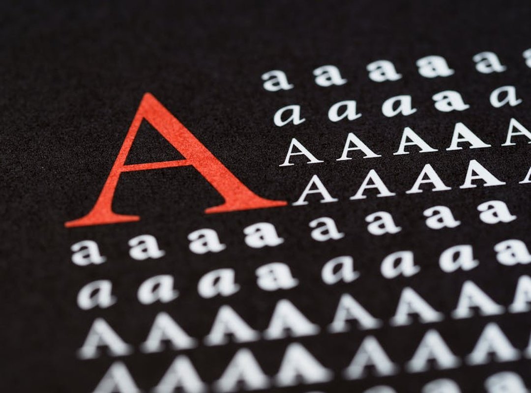
Color, contrast, and clarity at a small scale are key. These elements stop a player’s scroll and earn that all-important click.
Imagine a bright, eye-catching icon with bold colors and sharp lines. It pops out from the sea of dull, generic icons. That’s the kind of sensory detail that makes a difference.
So, when you’re designing your icon, focus on making it stand out. Use vibrant colors, high contrast, and clear, simple designs.
Remember, in those crucial three seconds, you need to make an impact.
Designing Marketplace Icons That Demand a Click
When it comes to creating standout icons for the Roblox marketplace, you need to think like a designer and a marketer. Some might argue that simple is boring, and but I disagree.
Simple can be powerful.
Tip 1: Use a bold, clean silhouette, and this is crucial. Your icon needs to be instantly recognizable, even when it’s tiny.
Think about the classic Apple logo, and it’s simple, yet it stands out.
Tip 2: Employ strategic color theory. Use contrasting colors or a vibrant, unique palette. This helps your icon stand out in a sea of similar items.
Just make sure it’s not so wild that it looks unprofessional.
Tip 3: Add a ‘visual hook’ or ‘glimmer.’ A subtle highlight, shine, or particle effect can draw the eye and suggest high quality. But don’t overdo it, and too much glimmer can look cheap.
Tip 4: Ensure the icon accurately represents the item. Avoid ‘clickbait’ visuals. If your icon doesn’t match the product, you’ll get poor reviews and lose trust.
Honesty is key.
Some people might say, “Why bother with all this? Just use a basic image.” Well, if you want your item to get noticed, you need to put in the effort. Basic images blend in, and blending in means getting overlooked.
For those who aren’t design pros, there are simple tools and techniques you can use. Roblox Studio has specific lighting options that can help. Free photo editing software like GIMP or Canva can add borders and highlights.
These tools make it easier to create professional-looking icons without breaking the bank.
Remember, the goal is to make your icon pop. But it also needs to be true to what you’re selling. Trust me, a well-designed, honest icon will do more for your sales than any amount of flashy but misleading imagery.
If you need more inspiration or tips, check out Janlersont for some great examples and tutorials.
Beyond the Icon: Mastering 3D Previews and Thumbnails
Once a player clicks the icon, the 3D preview must seal the deal by showing the item’s value.
Context is key. Always show accessories on an actual Roblox avatar, not just floating in a void. This helps players visualize themselves using the item.
A character striking a cool pose is far more engaging than the default T-pose. Think about it—would you rather see a boring, static figure or one that looks like it’s ready for action?
Here’s how to set up professional-looking “photoshoots” in Roblox Studio:
- Custom Lighting: Use soft, natural lighting to highlight the item. Avoid harsh, direct lights that can create unflattering shadows.
- Camera Angles: Experiment with different angles to find the most flattering view. A slight angle can make a big difference.
- Backgrounds: Choose a background that complements the item. A simple, clean backdrop can make the item stand out.
For items with special effects (e.g., glowing particles, animations), ensure the preview thumbnail or GIF clearly showcases this unique feature in action.
Pro Tip: Use a high-quality GIF to capture the full effect. A still image won’t do justice to those dynamic elements.
Remember, the goal is to make the item look premium. A well-crafted 3D preview can be the difference between a sale and a pass.
 Example of a well-posed and professionally lit 3D preview.
By following these steps, you can create 3D previews and thumbnails that not only look great but also help players see the true value of your items.
Your Visual Blueprint for Marketplace Dominance
Roblox marketplace images are the first point of contact with potential buyers. A powerful icon stops the scroll, and a compelling preview confirms the purchase. Visual polish isn’t just an add-on; it’s essential for boosting sales and visibility.
Is your icon clear and vibrant? Does your preview show the item in context? Does it look high-quality?
These are the questions to ask before publishing.
Challenge yourself to revisit one of your underperforming items and apply these visual upgrades. Consistent, high-quality visuals will build a reputation and a loyal following of players who trust your brand.